One design system across five fintech products
- Client
- HydrogenPay
- Sector
- Fintech
- Services
- Design System, UI Design, Accessibility, Design Tokens
- Year
- 2024
Results
−35%
design-to-development handoff time
−60%
UI inconsistency bugs
62 → 78
system usability scale, before and after
The brief
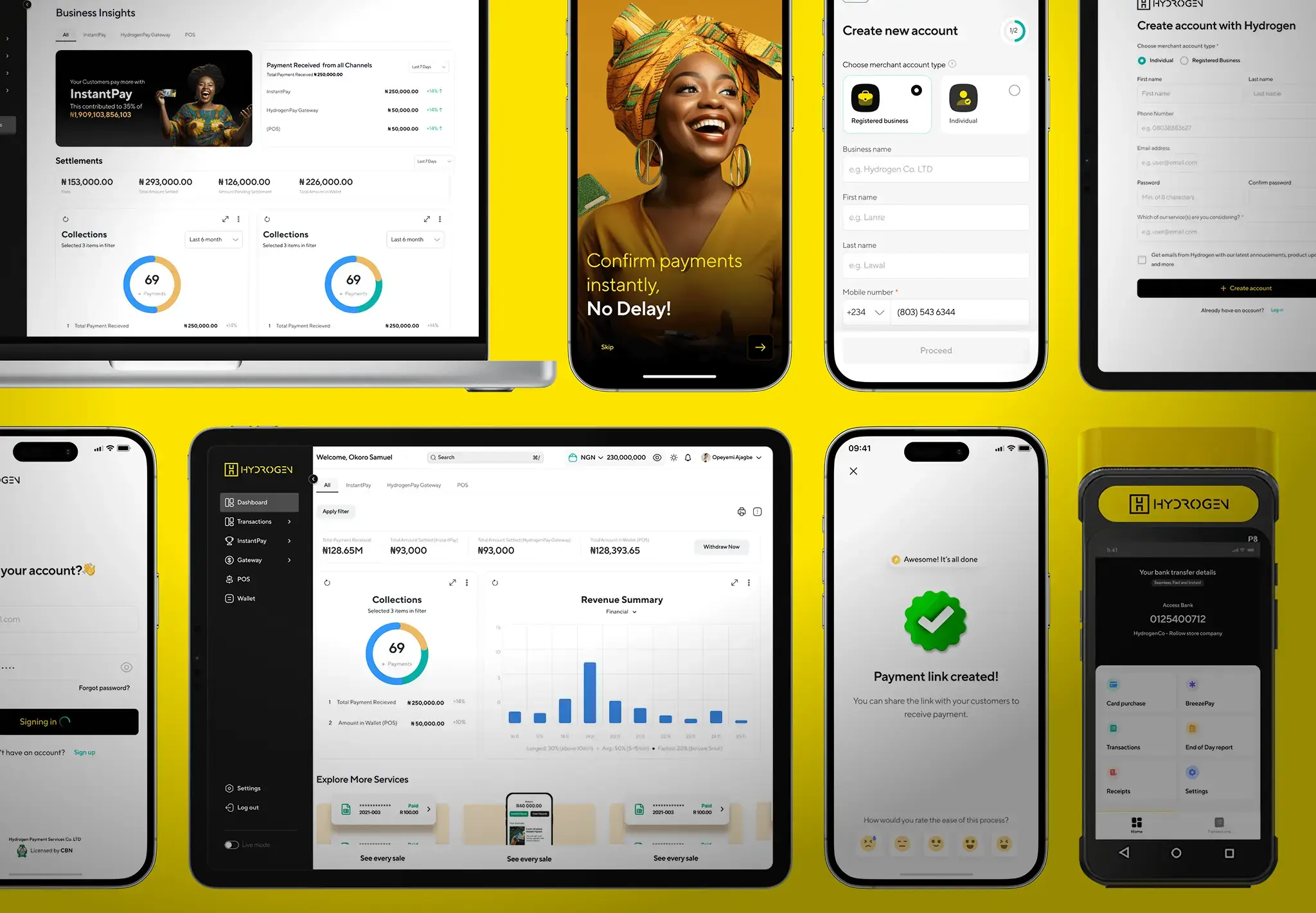
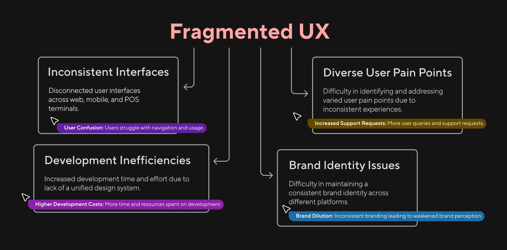
HydrogenPay had five products (web, mobile POS, merchant dashboard, API portal, admin console) that looked like five different companies built them. Support tickets tagged 'confusion' had tripled in six months.
Design
What we found
Fourteen different button styles across the five products: same action, different visual. No shared font scale: body text ranged from 12px to 18px depending on which product you opened. Customers moving between the mobile app and the merchant dashboard could not find the same features in the same places, and buttons meaning “confirm payment” on one screen said “proceed” on another.
The root cause was not talent. Every squad had good designers and good developers. They had no shared vocabulary, so each solved the same problems separately and arrived somewhere different.
What failed
The first approach was to retroactively style-match existing screens: update the CSS, keep the layout, minimise disruption. It was a disaster. Old spacing quirks butted against new component padding and some pages ended up carrying two visual languages at once. Rebuilding surfaces on the system turned out to be faster than negotiating with the old ones.
Outcome
Handoff time dropped 35% and UI inconsistency bugs fell 60%. System usability moved from 62 to 78. Four of the five products had adopted Poseidon within six months, with 120+ components covering the shared patterns at WCAG 2.1 AA.
Design
- Figma libraries
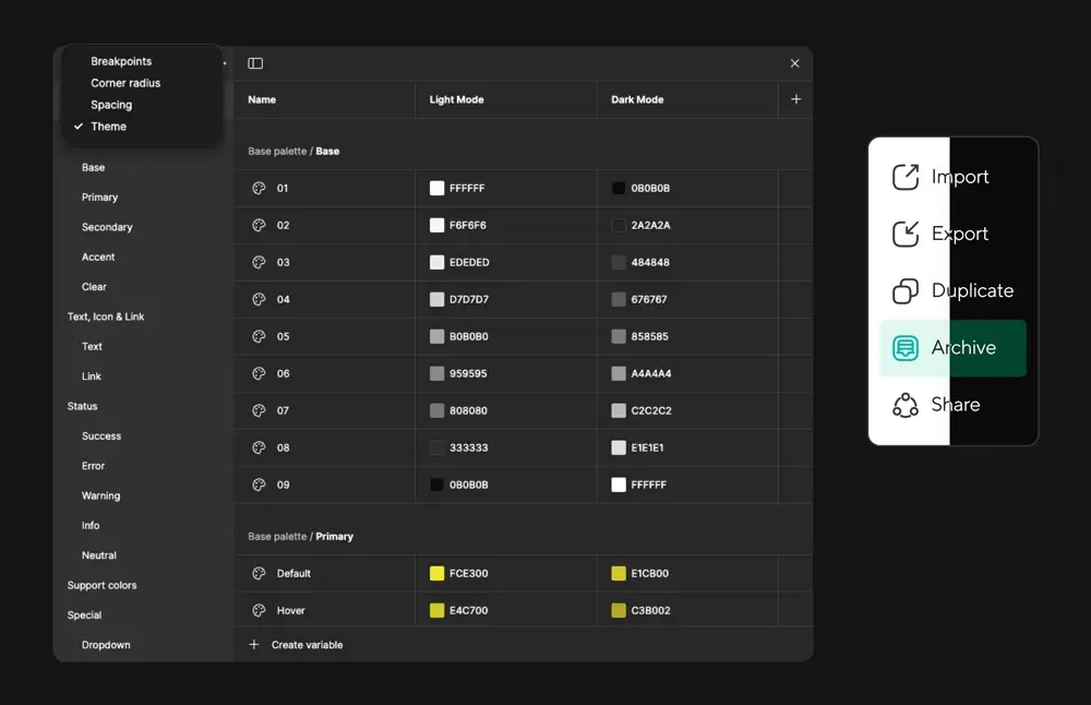
- Design tokens
- 120+ components
- Variants & presets
Accessibility
- WCAG 2.1 AA
- Contrast auditing
- Focus order
- Touch targets
Handoff
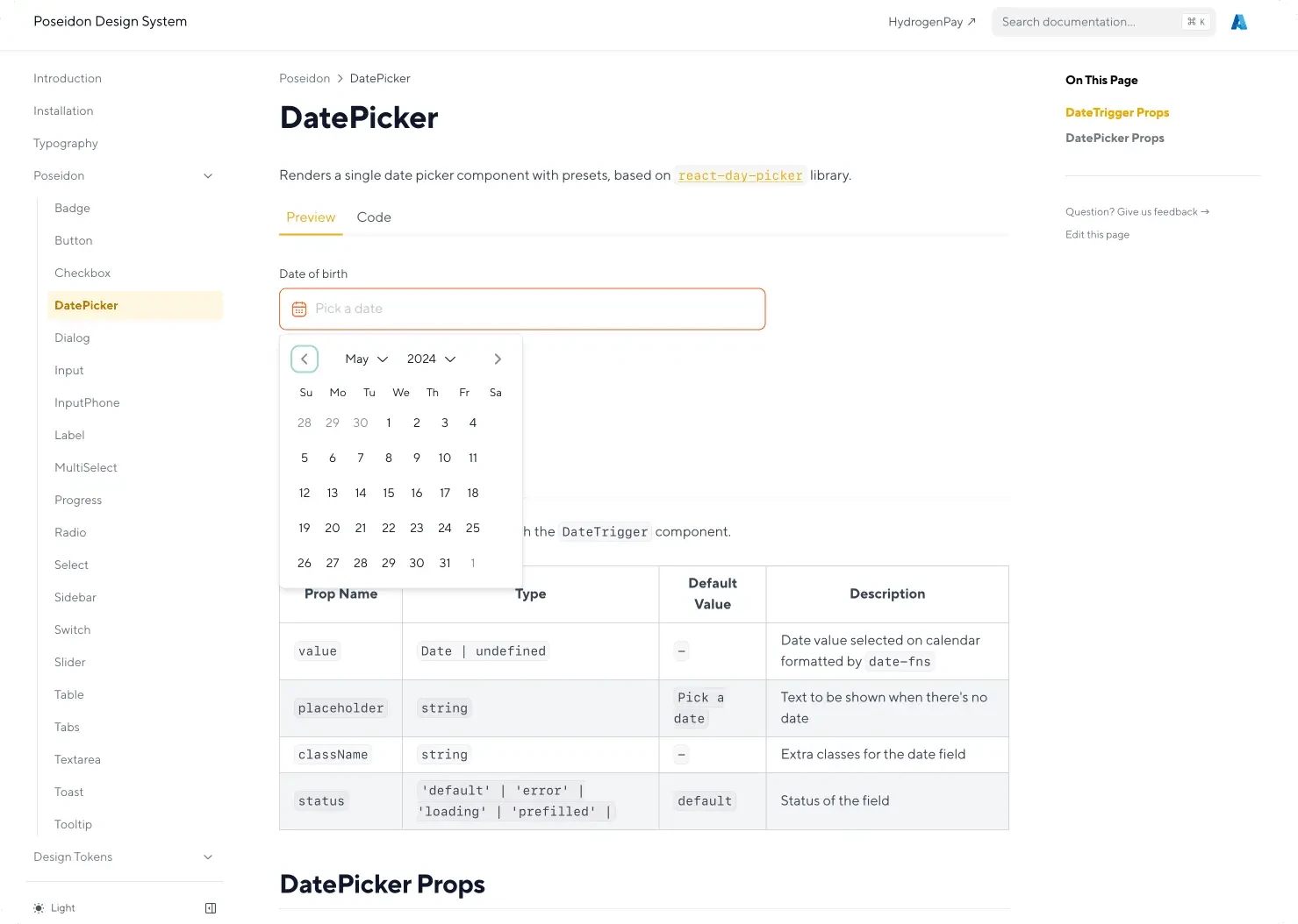
- Live component previews
- Documented props
- Usage guidance
Decisions that mattered
- 01
Abandoned retroactive style-matching. Updating CSS while keeping old layouts produced screens with two visual languages fighting each other; rebuilding surfaces properly was faster than patching them.
- 02
Shipped every component with props, presets and a live preview, so engineering could read the system instead of asking about it.
- 03
Set WCAG 2.1 AA as a component-level requirement rather than an audit at the end, which is why accessibility held as the system spread across products.