A design critic that does not need a meeting
- Client
- UX Buddy
- Sector
- Developer tools
- Services
- Product Design, Plugin Development, UX Research
- Duration
- 9 weekends
- Year
- 2025
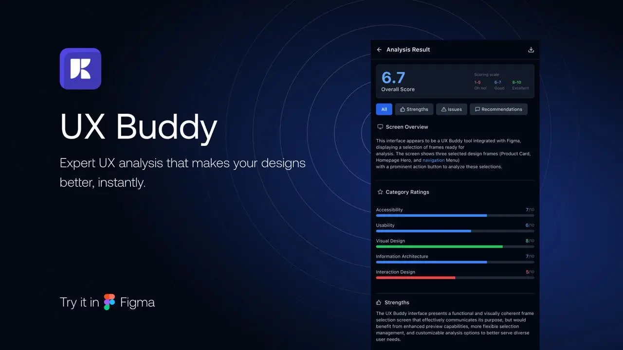
Results
122
designers using it, live in the Figma Community
6
critic personas, each with a distinct domain and voice
9
weekends from idea to published plugin
The brief
Finishing a screen means waiting for a lead, a stakeholder, an accessibility review. Most of that feedback is mechanical: spacing is off, contrast fails AA, the loading state is missing. It does not need a human, it needs a checklist with eyes.
Design
The problem with design feedback
Every designer knows the cycle: finish a screen, wait for someone to look at it, receive feedback that is mostly mechanical. Spacing, wrong component, contrast failure, missing loading state. None of it required a person. It required a checklist with eyes.
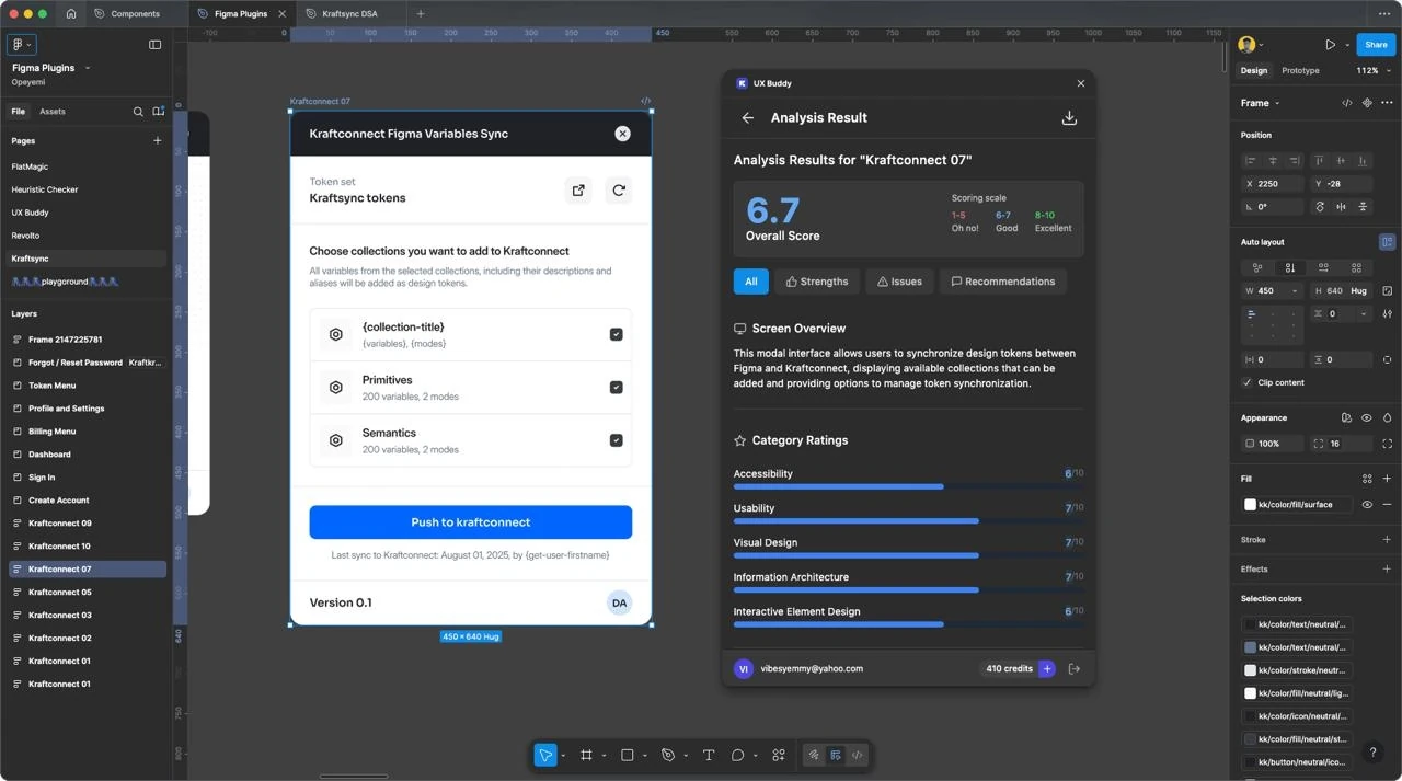
Six critics, each with a point of view
The mistake most design checkers make is generic feedback. Each critic here has a distinct domain and voice: an accessibility auditor covering contrast, touch targets, focus order and screen reader labels; a visual design critic on colour harmony, type scale, the 8px grid and whitespace; a usability tester; and three more.
Build
What we shipped
A Figma plugin: select a frame, scan, receive a structured report. Built and published over nine weekends in 2025.

Outcome
122 designers use it, live in the Figma Community.
Front end
- Figma Plugin API
- TypeScript
- React
- Figma UI kit
AI
- Multi-persona prompting
- Structured critique output
- Scan-to-report
Ship
- Figma Community
- Versioned releases
- Usage analytics
Decisions that mattered
- 01
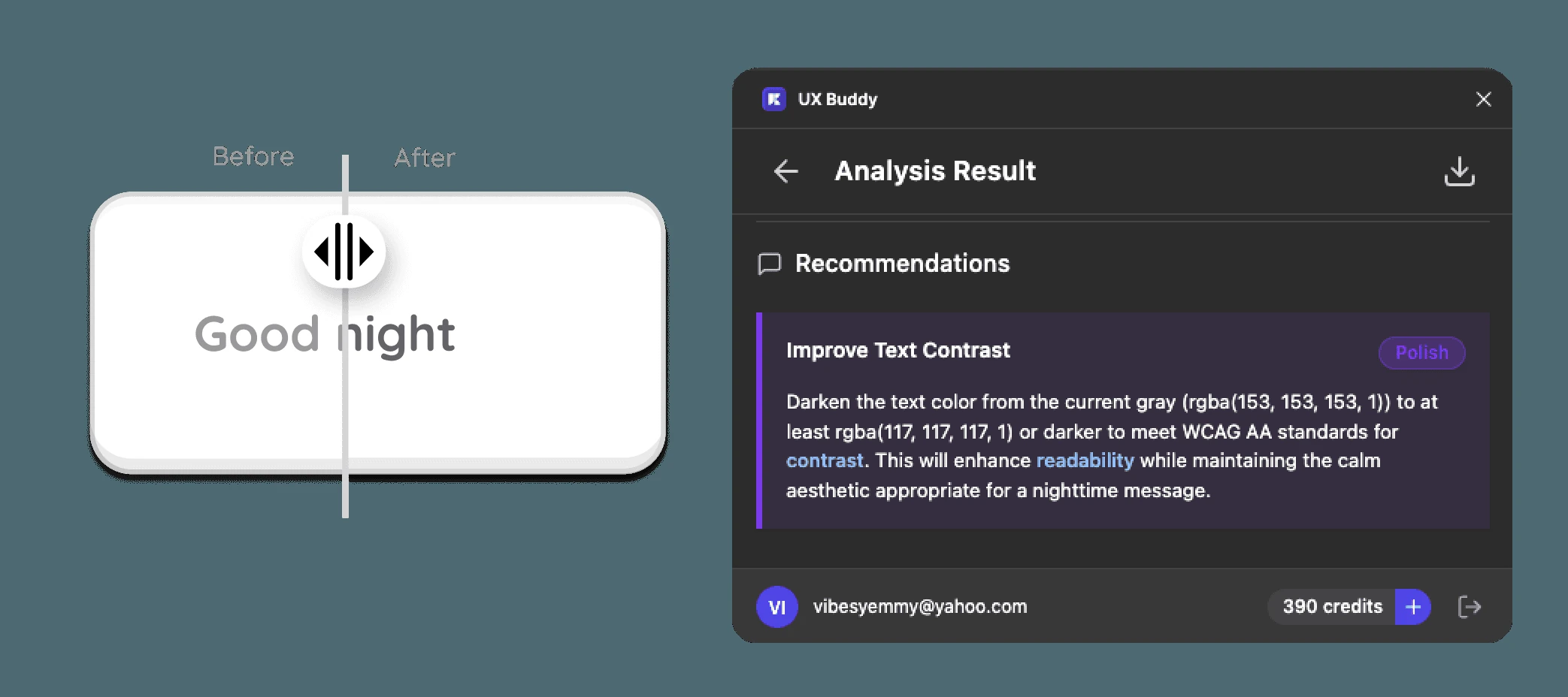
Gave each critic a domain and a voice instead of one generic reviewer. 'Improve visual hierarchy' is unusable; 'your CTA at 44px should be 48px to meet WCAG touch targets' is fixable before the next coffee.
- 02
Made the output a report rather than a chat. Designers want a list they can work through, not a conversation to maintain.
- 03
Scoped it to what a checklist genuinely does better than a person (contrast, targets, focus order, grid, missing states) and left judgement to the humans.